The captured webpage is different from a real phone
html.to.design simulates the capture of mobile phone viewport when using the viewport feature.
Sometimes it doesn’t render like on a real mobile phone because the websites are not responsive the viewport sizes but try to detect if the device is a mobile phone or not. For these sites, what you see in the browser and what is captured by html.to.design is different from what you would have in a real phone.
Most of these sites use the user-agent information to detect mobile device. You can change the user-agent of the browser to fix the problem.
How capture a mobile version of the website with a custom user-agent
1. Install our Chrome extension
Changing the user-agent is only possible with imports via the Chrome extension.
If you haven’t already, go to our Chrome extension page and click on Add to Chrome.
2. Follow the same steps as capturing a mobile version
Open devtools and activate Device Mode to be able to set your own viewport dimensions. You can see the full step-by-step here.
3. Change the user-agent
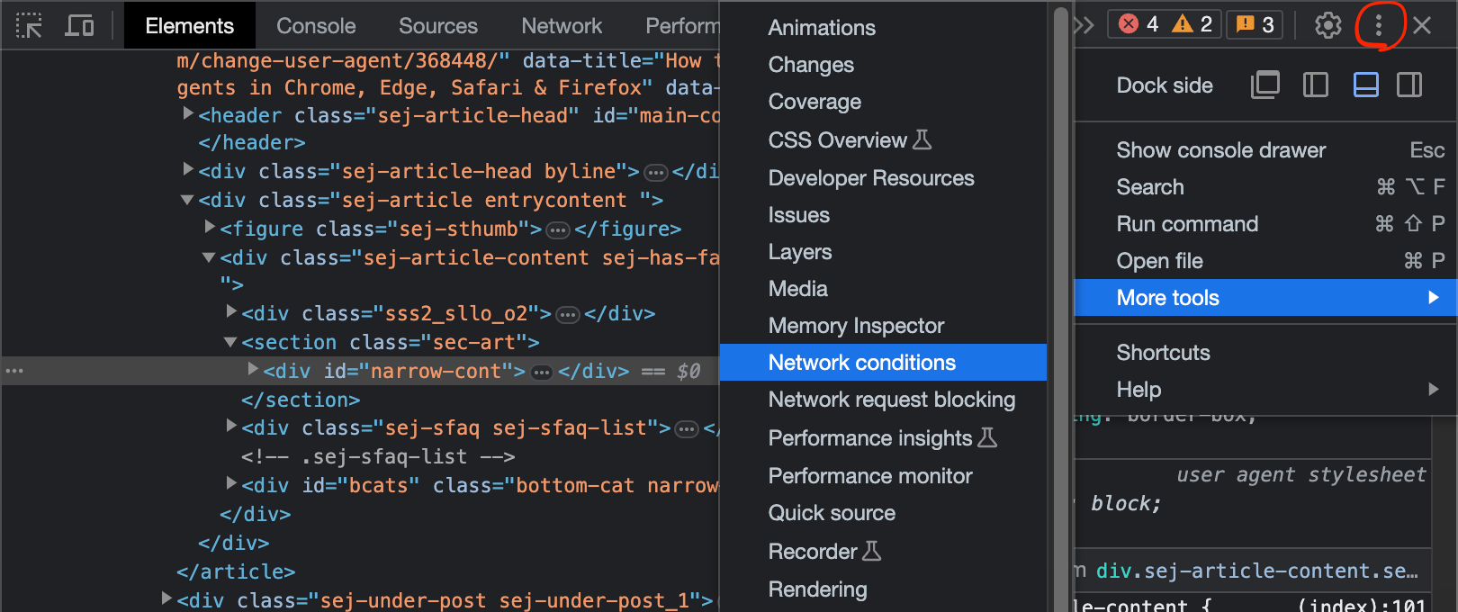
Go to the triple dot menu ︙ > More tools > Network conditions.
Unckeck Use browser default and select a Custom user agent.
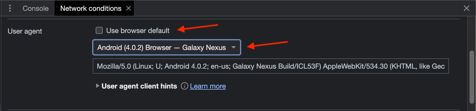
The webpage should be rending like a real mobile phone. If it’s not the case, then change to another user-agent until you find a valid one.
4. Capture page and import the .h2d file into Figma
Next click Capture full page in the html.to.design extension, and drop the generated .h2d file into the plugin.