Import a mobile version
Last updated
html.to.design can also capture and import the mobile version of your website or web app. Depending on whether the webpage is public or private (behind a log-in), there are two ways to capture the mobile version and import it into Figma.
For public webpages
-
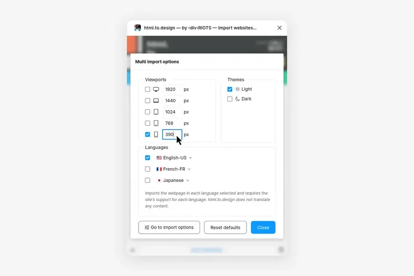
Open the settings menu where you can select the viewport sizes and theme(s) for your import.
-
You can either go with the preset mobile device size at
390pxor double-click to edit and enter the exact mobile width you want. (The length will be automatically determined by the amount of content on the webpage.)
For private webpages
-
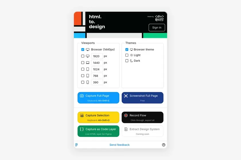
Open the extension
-
Tick the
390px viewport, or type another width in its field, then click Capture Full Page. The extension resizes the page to that width for the capture. -
Copy the capture to Figma, or send it to the Figma plugin to import it.
ℹ️ Some sites detect phones by their user agent rather than by width. If the capture doesn’t look like it does on a real phone, see The captured webpage is different from a real phone.