Better auto layout, layer organization and font mapping
Our team has been hard at work, and if you’ve used html.to.design lately, it shows! A few highly-requested improvements are now a reality, including a stronger auto layout engine, more organized layers and a new little font feature we think you’ll love…
Auto layout engine overhaul
With every update, html.to.design’s auto layout engine gets better and better. If you’ve been using html.to.design since the beginning, you’ll know how far it has come. The plugin can convert any website into designs with full auto layout seamlessly set up for you.
In one of our latest releases, we made the auto layout set-up superior and more powerful. So now, you can focus less on fiddling with auto layout settings and more on redesigning your webpage.
Better layer organization
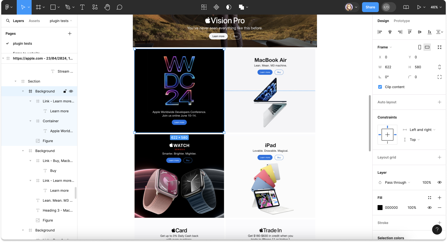
You asked, we listened! We were well aware that some imports came with too many layers, often nested under several levels, making it hard to find what you’re looking for. So our team got to work! Now, for any websites imported without auto layout, we’ve reduced the number and nesting of layers for much clearer and organized imports!

Font mapping
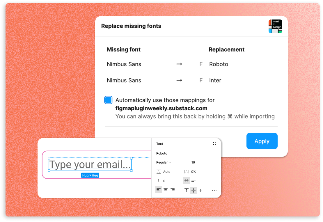
If html.to.design detects that you’re missing fonts for the website you’re importing, it now offers two options: you can either download that missing font directly from the plugin (a feature that has been around for a while now), or, you can select existing fonts you’d like to replace the missing ones with. The plugin will automatically use and map to your chosen fonts every time you import that webpage!

What are you missing?
We hope you’ll try out these new updates and that they help you get even more out of html.to.design. If there’s something you’re missing, you can always suggest new features and improvements in this feedback form.
Now, get into Figma to try out all these improvements! 🚀