UI audit in Figma; the first step to building a design system
A well-designed and consistent user interface (UI) is essential for creating a seamless user experience. To achieve UI consistency and efficiency, designers often rely on design systems and their reusable elements such as patterns, tokens and components.
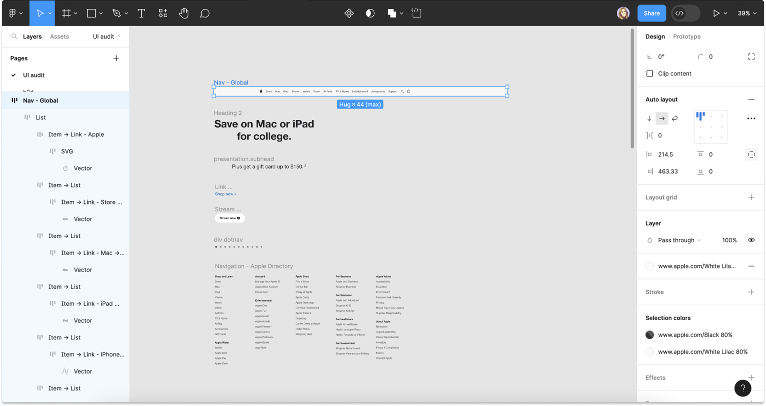
In many cases, the first step to building a design system is to perform a UI audit of existing designs, website or app. In this post, we’ll explore how to create a UI audit in Figma with html.to.design, taking advantage of the reusable elements from your existing website. Once you’re done, you’ll be on the right track to starting a design system!
How to create a UI audit in Figma
1. Run html.to.design…
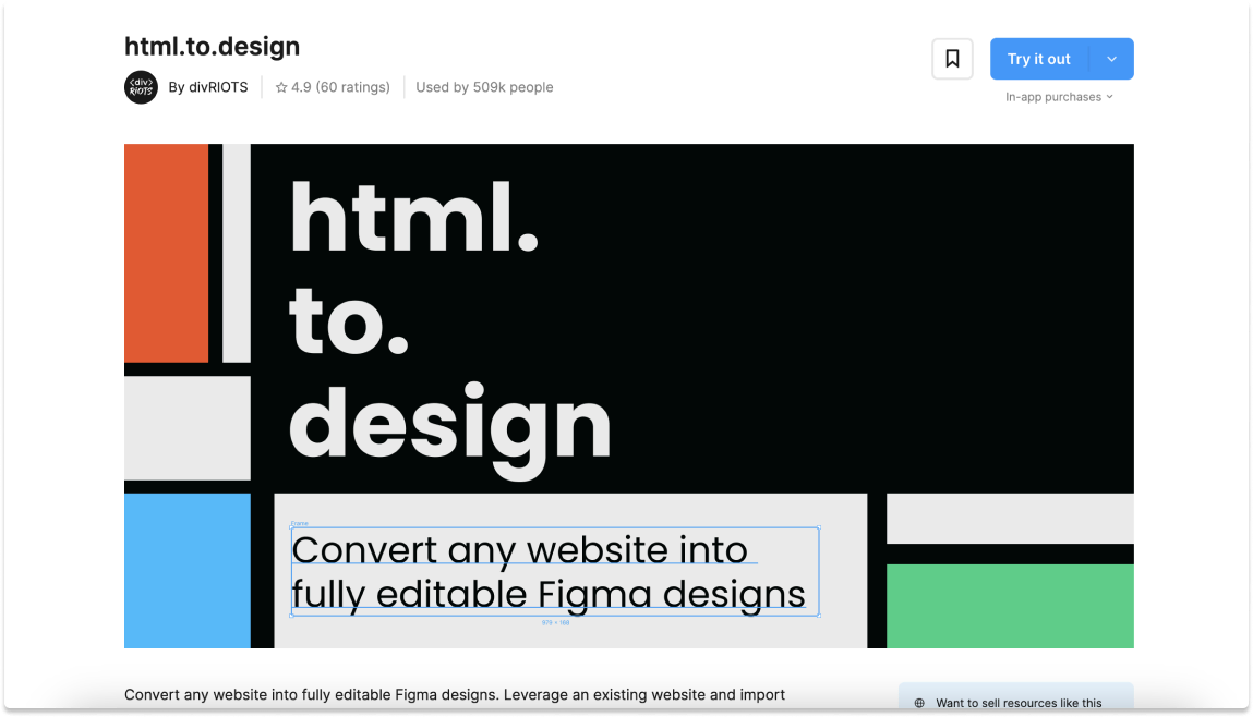
Look for the html.to.design plugin in Figma’s Community and click “Try it out”.
2. Import the website to audit…
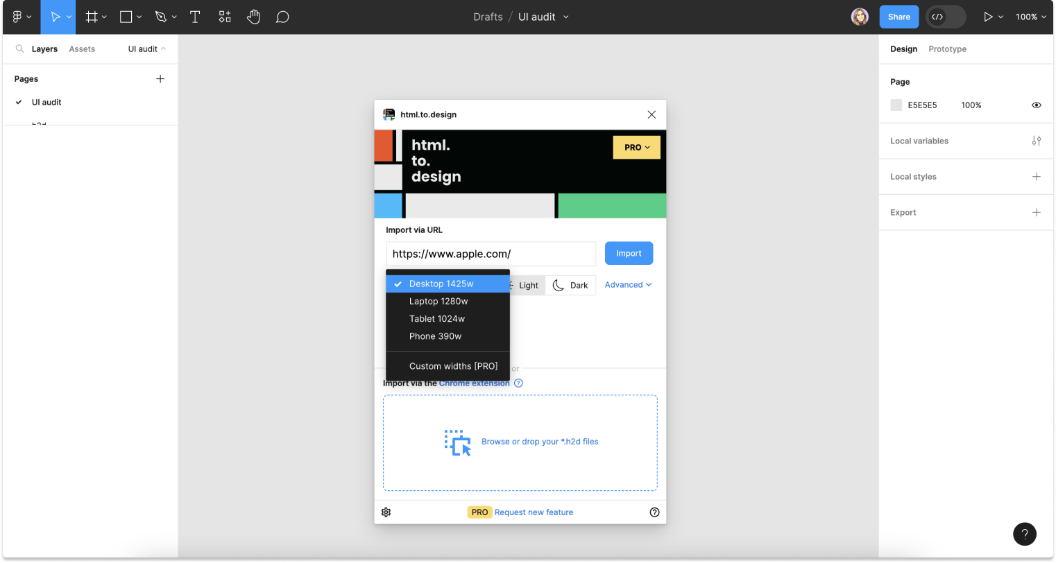
With html.to.design you can convert the website you want to audit into fully editable Figma frames. Paste the website’s URL in the plugin, define the viewport and theme and click “Import”.
👉 Alternatively, if you need to import a private webpage, you can use the Chrome extension that will capture exactly what you have in your browser.
3. Analyze your website’s existing elements…
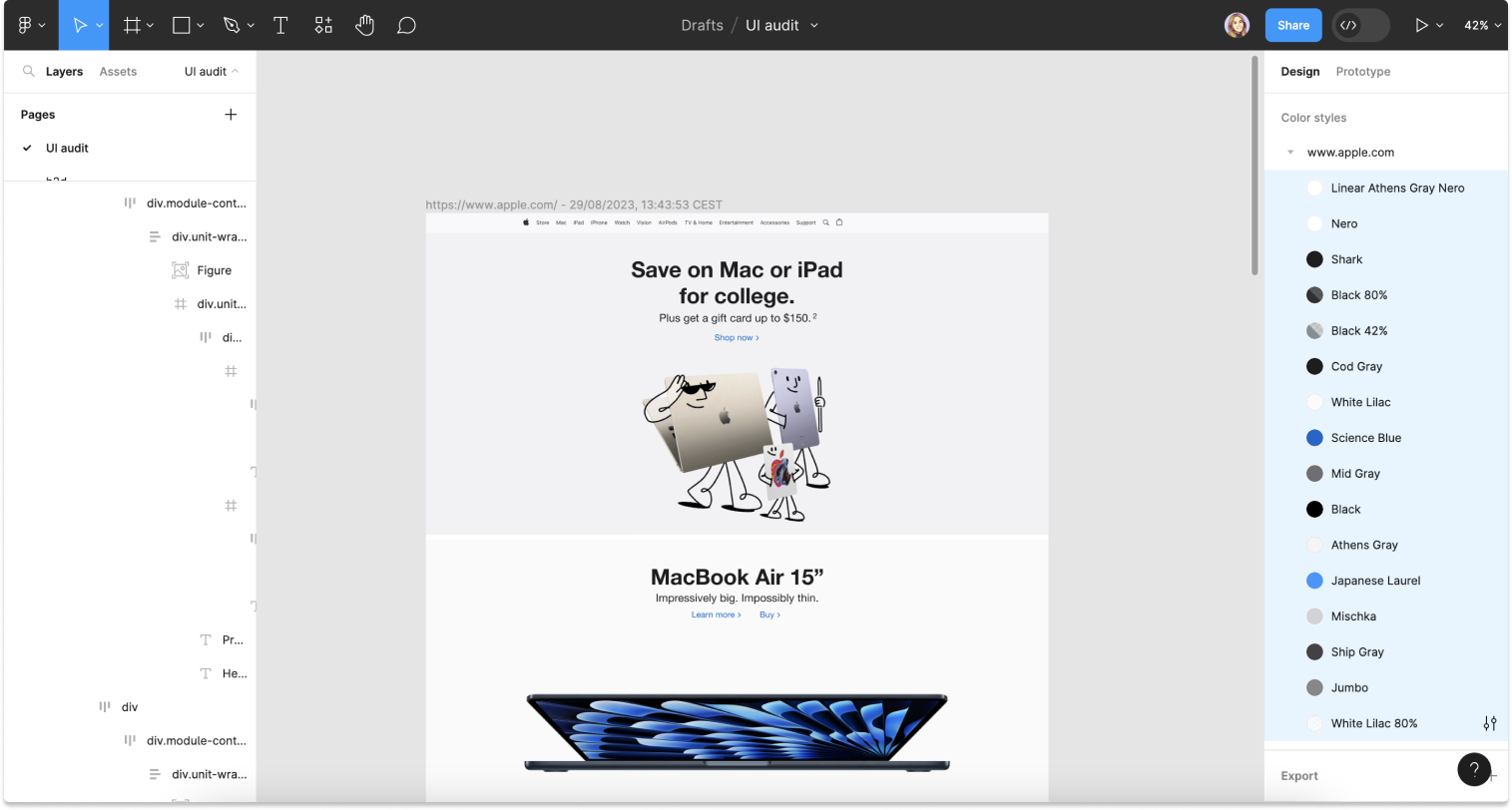
Now that you’ve converted the website into editable Figma frames, it’s time to analyze the existing UI elements for reusability. For example, there are 3 main elements to examine:
a) Typography and text styles: What typography choices and text styles are used throughout the website? Note the font families, sizes, line heights and weights. Identify common styles that can be standardized in a future design system.
b) Color palette: Evaluate the color scheme and identify recurring colors and their usage. Define primary, secondary and accent colors that could be incorporated into the design system’s color palette.
👉 Or, let the plugin generate text and color styles for your automatically.
c) Components: Look for consistent elements such as buttons, cards, blocks of content and inputs. Identify patterns that could be reused across the design system. The frames for each component or pattern can be dragged out of the imported website and organized by component for the UI audit.
4. Create a component library in Figma…
Now that you have identified reusable elements, it’s time to create a component library in Figma with the following steps:
a) Refine styles: Setting up the library’s styles, such as text, color and shadows; is a good first step for building your library. You can start from scratch by referencing the brand’s style guide or you can leverage the automatically generated styles offered by the plugin.
b) Create components: Using the previously selected UI elements, you can now begin turning them into Figma components and variants, which will ultimately make up the Figma library for your new design system.
c) Apply styles to the components: Make sure that you apply your created or generated styles to the newly formed components. If you need to change your design system’s styles in the future, having them applied to the components will make it easier to update and maintain them. You can edit the styles in one place, and the changes will automatically propagate to all instances of the components, ensuring consistency throughout your projects.
d) Organize components: Group related components together and organize them into categories. This will make it easier for designers and developers to locate and use the components in the future.
Try it out!
Performing a UI audit in Figma is now faster than ever thanks to html.to.design. You can create an inventory of your website’s existing UI elements that serves as a strong foundation for your design system. This process will help to streamline your team’s workflow, ensure UI consistency and save time on future projects.
Have you already used html.to.design to create a UI audit of your website? Share it with us! 👉 @html_to_design